Identity updates were everywhere in 2026, from tech products to household names. The headlines make it look as if every brand needs a dramatic reinvention. In reality, the right depth of change depends on what the business has become and what its audience already recognizes.
Three depths of change
Refresh
The brand is right at its core but no longer stretches to new uses. The wordmark, typography, palette or layouts are tuned. Instagram’s August 2026 wordmark update, its first in a decade and designed in-house, is a recent example of this lighter approach.
Rebrand
The business has outgrown its identity. The logo, color, type, imagery and voice are rebuilt together. Calendly’s 2026 rebrand, which Fast Company described as a move from a loud, bright identity to a softer, clearer one as its product expands, is a recent example.
Rename
The name itself no longer fits the business. This is the deepest and riskiest change, and it should be a last resort rather than a first instinct.
What recent identity changes have in common
Looking across recent identity updates, three patterns stand out. First, simplification: Adobe’s 2025 update, designed with Mother Design, paid homage to its original 1982 logotype while simplifying the system around it, and Instagram describes its 2026 wordmark as bolder and simpler.
Second, evolution over replacement: Instagram, Adobe and KFC all kept their most recognizable assets. Third, building around an asset the brand already owns. KFC’s June 2026 update, created with JKR, centers its system on the bucket and extends it across packaging, restaurants and digital.
Start by asking what must stay.
Protect what people already recognize
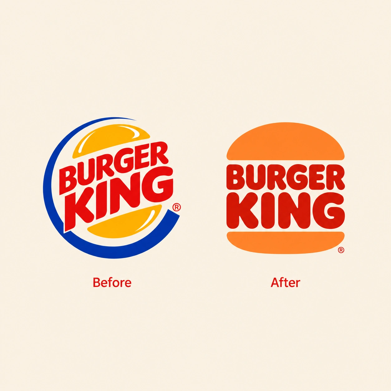
Rebrands tend to go wrong when they remove something audiences feel they own. Cracker Barrel’s 2025 logo change removed its “Old Timer” figure and drew such strong backlash that the company reversed it within about a week. The lesson is not to avoid change. It is to find out what your audience would miss before you touch it.
Signs you may need a refresh or a rebrand
- The business or its offer has changed significantly.
- The identity looks inconsistent across touchpoints.
- It feels dated next to competitors.
- The logo struggles on screens, small sizes or in motion.
- It cannot stretch to new products or audiences.
Signs you may not
- The concern is one person’s taste rather than a business problem.
- You want design to fix something it cannot, such as pricing or service quality.
Worth remembering: the most useful first step is an honest review of what to keep, what to change and what to clarify. The answer often turns out to be smaller than expected.
Conclusion
Refresh, rebrand and rename are three different tools. Choosing the lightest one that solves the problem protects the recognition you have already earned and keeps the investment proportionate.
Not sure whether you need a refresh or a full rebrand? Tell us about your business and what you need.