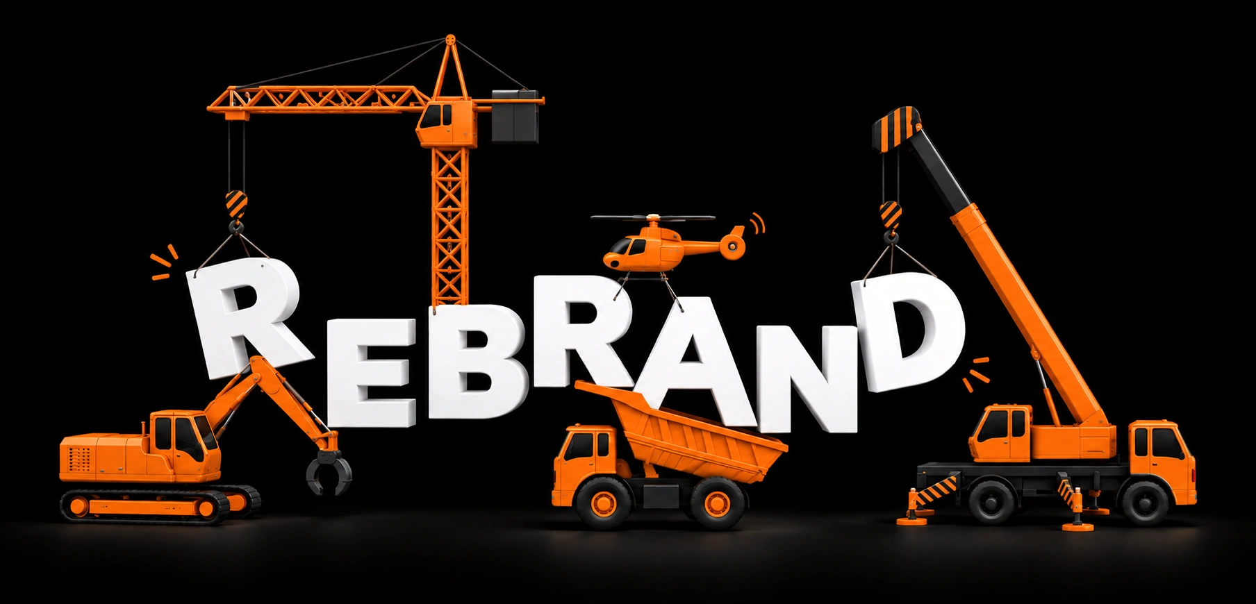
Every year brings a fresh round of brand forecasts. The 2026 ones use different vocabulary, but they point in the same direction: away from static, over-polished sameness and toward identities that adapt, express and feel human. Some of that is worth acting on. Some of it will look dated in eighteen months.
From a static logo to an adaptive system
Identity work in 2026 is increasingly judged by how it behaves, not just how it looks on a presentation slide. Forecasts from several studios describe motion-first systems: logos and graphic elements that animate, simplify and respond to where they appear. A mark may sit still on a business card, move on a website and shrink to a few pixels in an app.
The practical lesson is to design for those situations from the start. Decide how the mark simplifies at small sizes, how it moves, and which parts of the identity stay fixed no matter what. A system with clear rules can flex without losing itself.
Typography is doing more of the talking
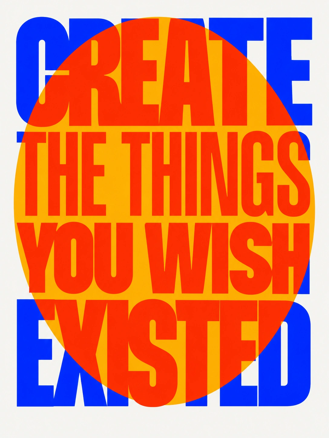
Typography keeps moving from supporting role to lead. Custom and variable typefaces, character-driven letterforms and bold type used as a graphic element all show up in the 2026 roundups. When a symbol is absent or interchangeable, a distinctive typeface can carry recognition on its own.
The caution is readability. Expressive type earns its place only if people can still read it quickly, on every screen and at every size.
A trend should sharpen an identity, not replace it.
Human craft in an AI-saturated feed
The most discussed shift is a reaction to generative AI. Creative trend reports, including Adobe’s 2026 forecast as summarized by several outlets, describe a pull toward organic, analog and imperfect work: hand-drawn letterforms, visible texture, collage and rough edges that signal a person made the decisions.
That does not make AI off-limits. It is useful for research, exploration and quick variations. The risk is letting it set the direction. Strategy, taste and the final finishing are still where a brand becomes specific, and specific is what people remember.
Tactile, textured and accessible
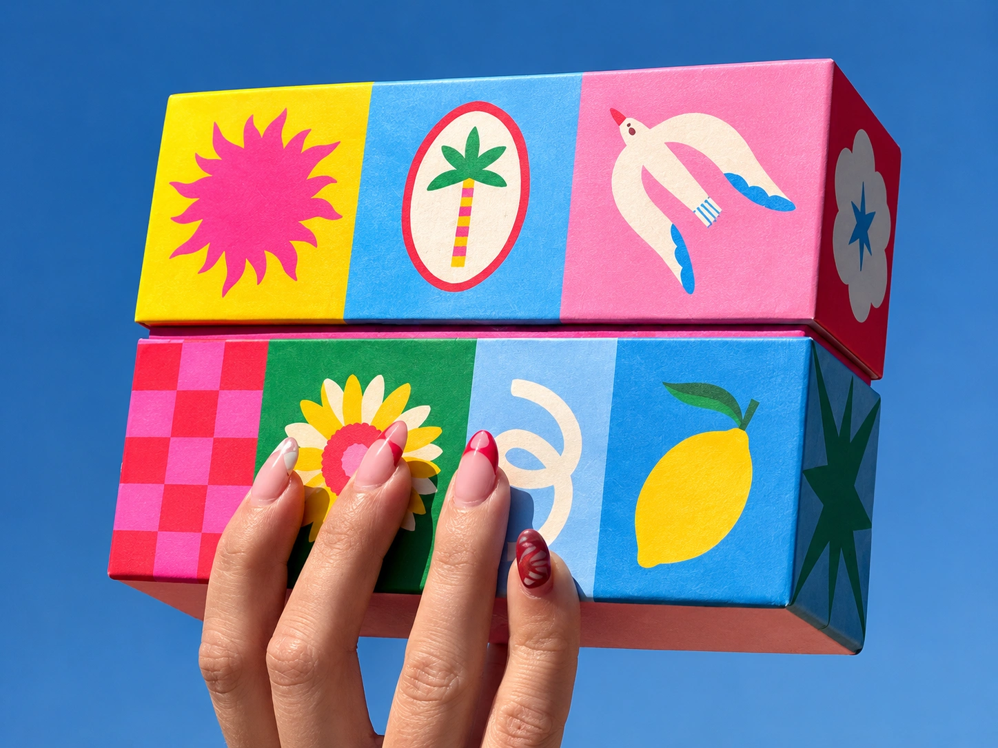
Texture and materials are being treated as part of identity, especially in packaging, where how something feels is part of how it is remembered. At the same time, accessibility is moving from a final check to a starting point: readable contrast, clear hierarchy and motion that respects people who prefer less of it.
A quick filter before you adopt a trend
- Does it express something true about the business?
- Will it still make sense in three years?
- Does it work small, in one color, and in motion?
- Is it accessible to the people who need to use it?
- Could a competitor use the same look without changing anything?
In short: use trends as seasoning. A durable core identity, refreshed with the right current ideas, will age far better than a brand rebuilt around whatever is fashionable this year.
Conclusion
The best 2026 thinking is less about a single look and more about identities that are flexible, expressive and clearly made by people. If your brand is clear about who it is, those ideas become tools. If it is not, no trend will fix that.
Want an identity built to last rather than to follow trends? Tell us about your business and what you need.