A good logo looks effortless, which hides how much decision-making sits behind it. It is not one flash of inspiration. It is a sequence of choices, each made with a reason. This is how we move from a blank page to a mark a business can use with confidence.
Step 1: Discover
We start with the business, not the brand mark: what it does, who it serves, who it competes with and where it wants to go. We look at how competitors present themselves so the new logo does not blend in. The key question is what the logo needs to achieve, not just how it should look.
Step 2: Define
Research becomes a short, focused brief: the positioning, the personality and the visual territory to explore. We agree a small number of directions, because a logo that tries to say everything usually says nothing.
Step 3: Explore
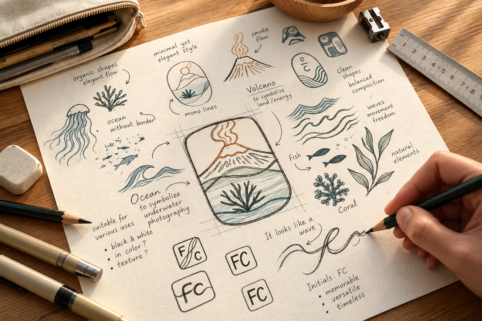
Ideas start on paper. We sketch symbols, test typefaces and play with composition before anything becomes a polished file. Early on we test concepts in black and white and at small sizes, because a mark that depends on color or size to work is not strong enough yet.
If a logo only works on the presentation slide, it is not finished.
Step 4: Build
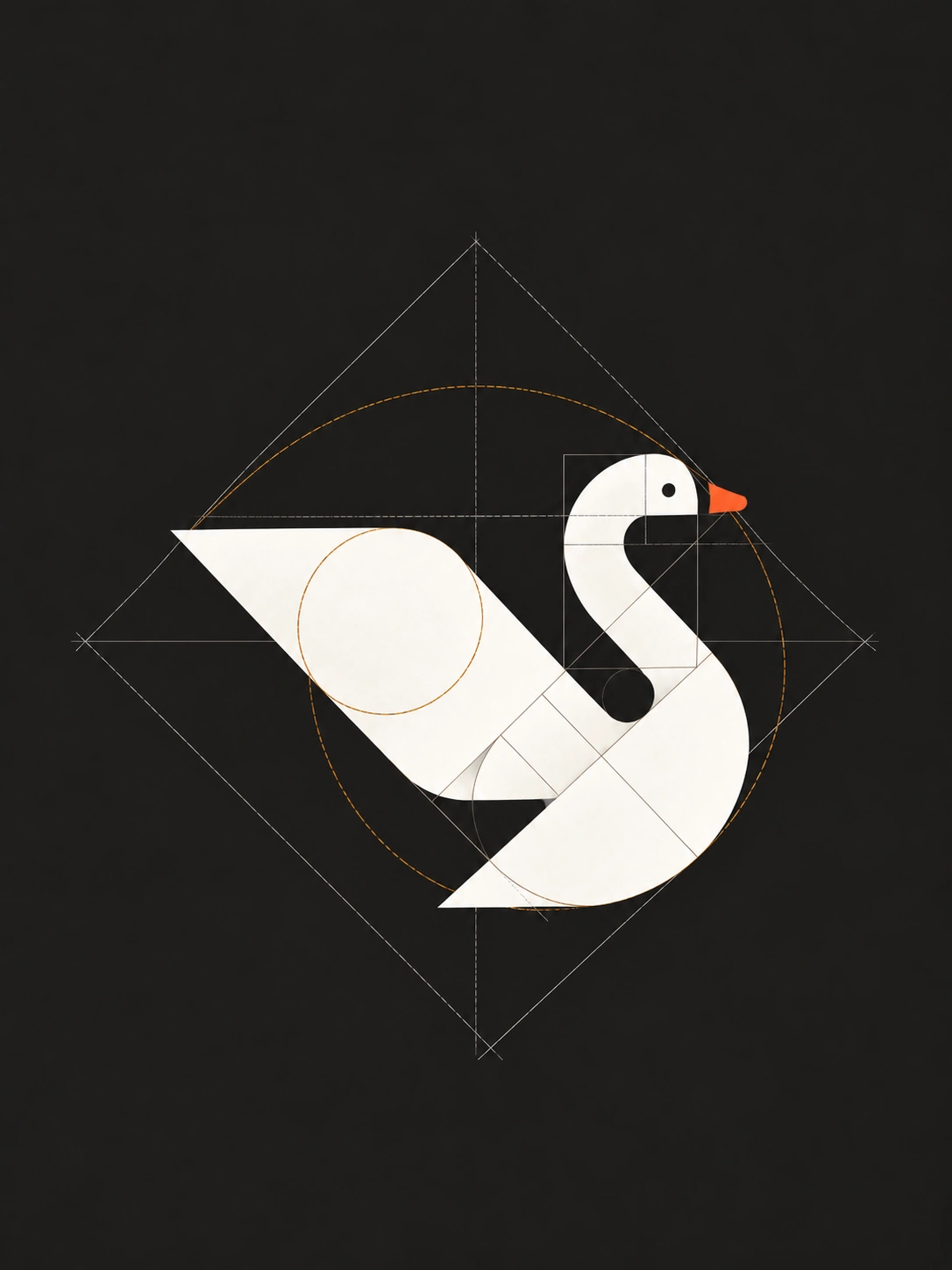
The chosen direction is built properly: precise geometry, balanced spacing, and careful letter-fitting for wordmarks. We create the versions a real business needs, such as horizontal and stacked layouts and an icon-only mark for small spaces like app icons and social avatars.
Step 5: Refine
Feedback is most useful when it is about the problem rather than personal taste. We refine the selected direction and test it where it will live: a website header, a social profile, packaging, signage and a favicon. Revisions improve the solution; they do not restart the project without a strategic reason.
Step 6: Deliver
Once the logo is approved, the agreed files are prepared for real use: vector files for print and large formats, web-ready versions, color and one-color variations, plus clear guidance on how to use them. The exact deliverables are confirmed before the project begins.
What logos need to do in 2026
Current trend reports treat the logo as one part of an adaptive system that has to work across websites, products, social channels and motion. Many recent identity updates simplify or refine an existing mark rather than rebuilding it, and typography-led marks are becoming more common.
A short checklist for any logo
- Is it recognizable at a very small size?
- Does it work in one color, on light and dark backgrounds?
- Does it have a clear plan for motion and for simplified versions?
- Is it distinct from competitors?
- Will it still make sense as the business grows?
In short: a strong logo comes from a clear brief, honest testing and careful craft, not from following a style.
Conclusion
The process matters as much as the result. A clear sequence removes confusion, keeps decisions grounded and produces a logo the business can rely on for years.
Ready to start a logo or brand identity project? Tell us about your business and what you need.