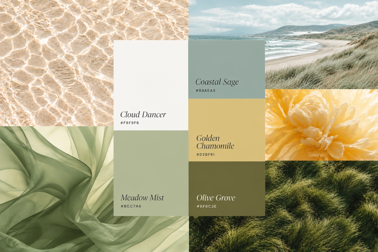
For 2026, Pantone named PANTONE 11-4201 Cloud Dancer its Color of the Year, announced in December 2025. It is a white, and the first white the program has chosen since it began in 1999. Pantone describes it as a “billowy, balanced white” and a blank canvas that signals a fresh start.
Designers have been pointing to a second direction at the same time: earthy, grounded palettes made of warm sand, clay, khaki and muted greens, often lifted by a toned-down jewel accent. Together they describe a year that favors calm over noise. Here is what to take from that.
What Cloud Dancer signals
The message is simplification: more space, more quiet, fewer competing colors. Reactions to the choice were mixed, which is normal for a white. For brands, the useful idea is not to make everything white. It is to give color room to breathe, and to build palettes on a warm or balanced neutral rather than a stark one.
Earthy palettes and why they work
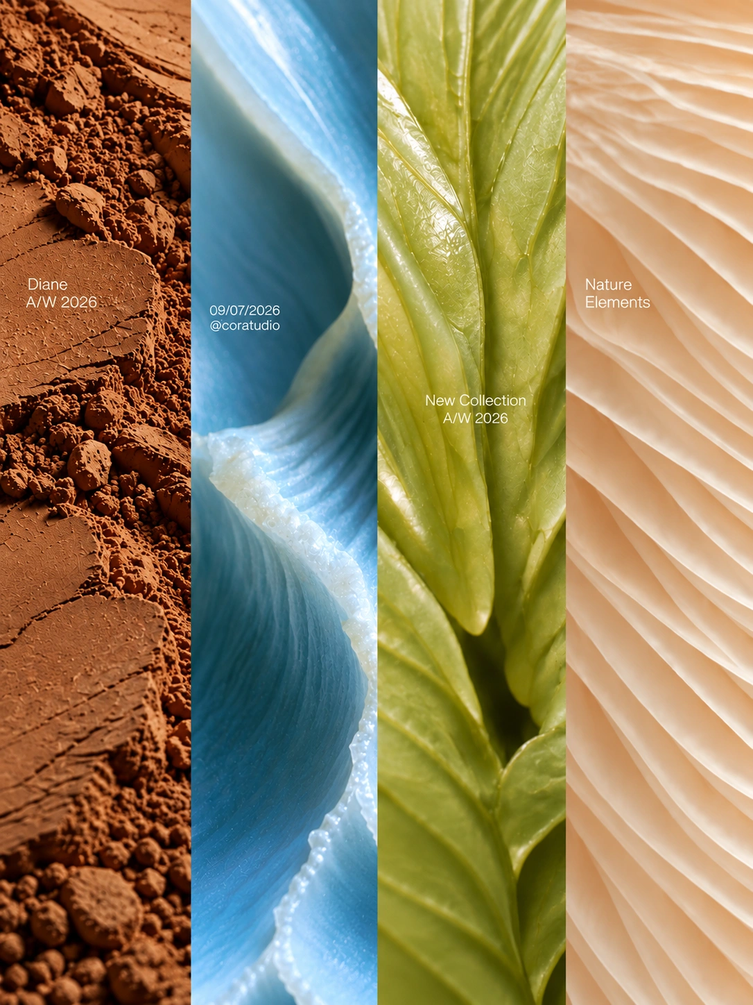
Earthy colors feel natural and honest without needing to announce themselves as eco brands. They pair well with texture, craft and imperfect, human-made visuals, which is also where much of 2026 design is heading. The most effective versions keep one confident accent so the palette has energy as well as calm.
A palette is a set of decisions, not a set of swatches.
How to build a brand palette that lasts
1. Start with the feeling and the audience
Decide what the brand should make people feel before you look at a single swatch. Color is a signal, so the signal should be chosen on purpose.
2. Give every color a role
A reliable structure is one primary color, one or two secondary colors, a set of neutrals (including a warm white and a deep dark), and a single accent. Roles stop a palette from becoming a free-for-all.
3. Check contrast early
Under WCAG AA, body text needs a contrast ratio of at least 4.5:1 against its background, and large text and interface components need at least 3:1. A palette that fails those tests will be difficult to use on a website no matter how good it looks on a mood board.
4. Test in real conditions
Check the palette on screen and in print, in light and dark settings, at small sizes and on actual packaging materials. Colors change with context, and it is better to find that out before launch.
5. Document the values
Record HEX and RGB for screens, CMYK for print and a Pantone reference where one is needed. A palette that is written down stays consistent when more people start using it.
Worth remembering: choose colors for the next five years, not the next five months. Let the color of the year show up in campaigns and accents, not in your core identity.
Conclusion
Cloud Dancer and earthy neutrals share one lesson: restraint is a strength. Pantone usually announces its next color in early December, so expect the conversation to shift again. A palette built around clear roles and real contrast will handle that without being redesigned.
Need a color palette that is distinctive, accessible and built to last? Tell us about your business and what you need.