Case study

RHEVA

Expertise in Motion.

RHEVA is a brand identity for an aesthetic medicine academy in Istanbul, built around the idea of “Expertise in Motion.” The visual system combines academic authority, scientific precision and professional warmth through a distinctive R symbol, refined typography and a light, structured visual language designed across print, digital, environmental and educational applications.
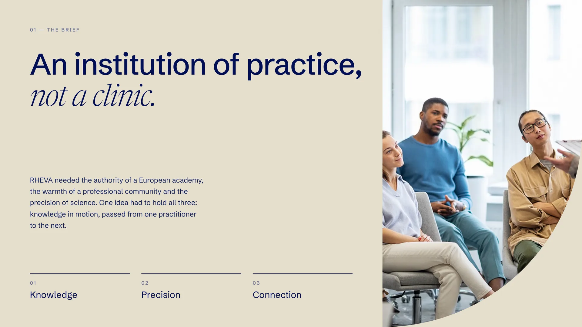
An institution of practice, not a clinic.
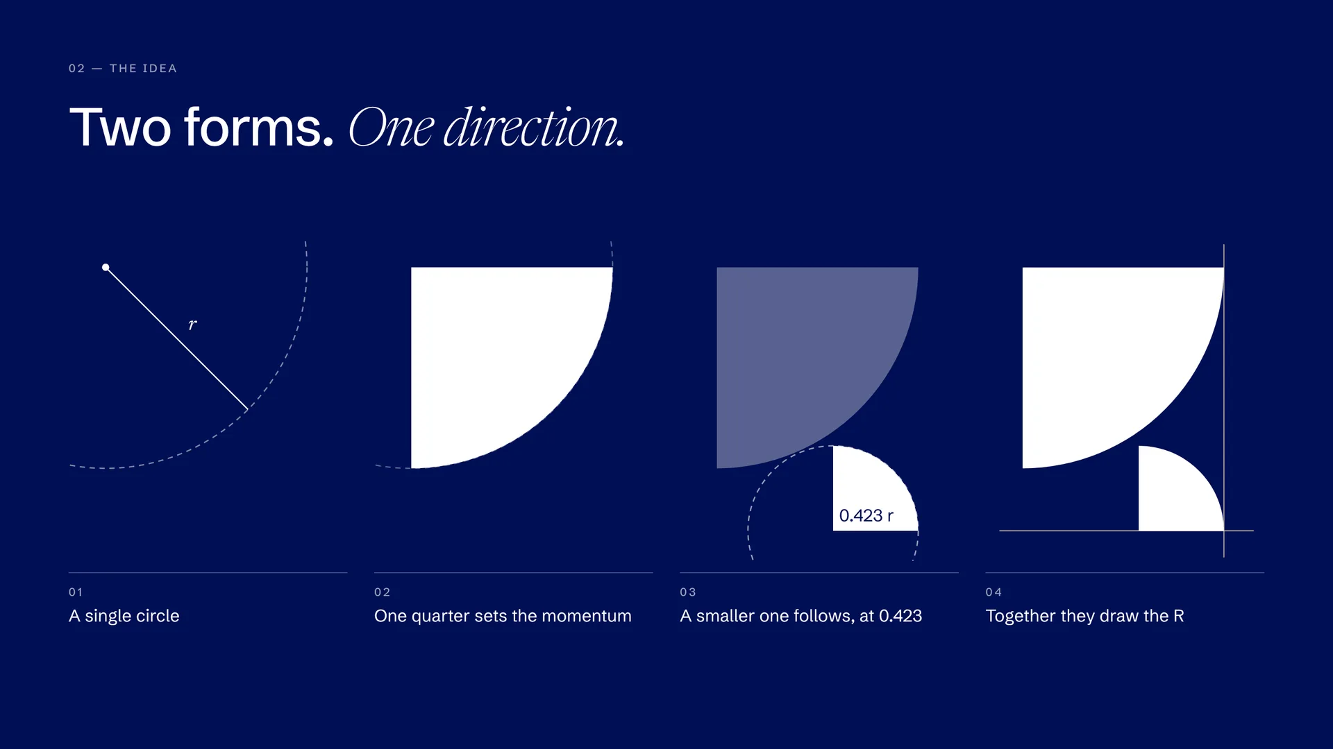
Two forms, one direction. From a single circle to the R.
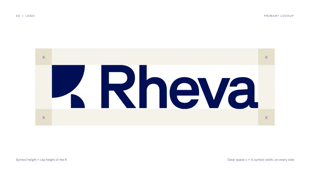
The primary lockup and its clear space.
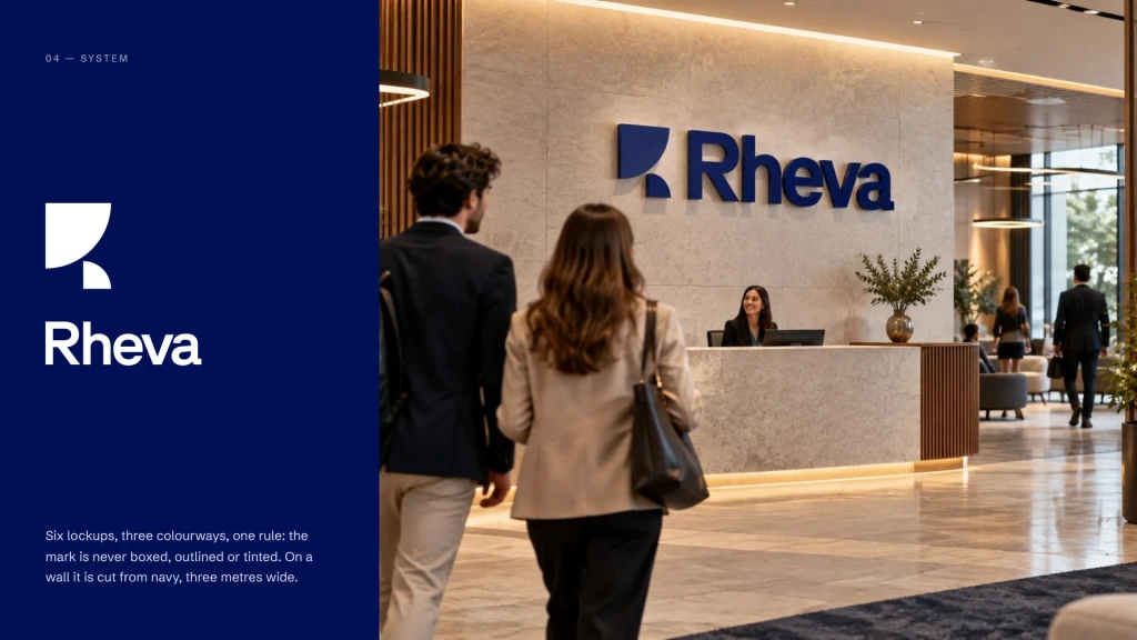
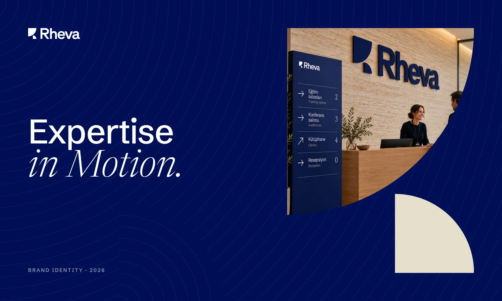
The mark in space, cut from navy on the reception wall.
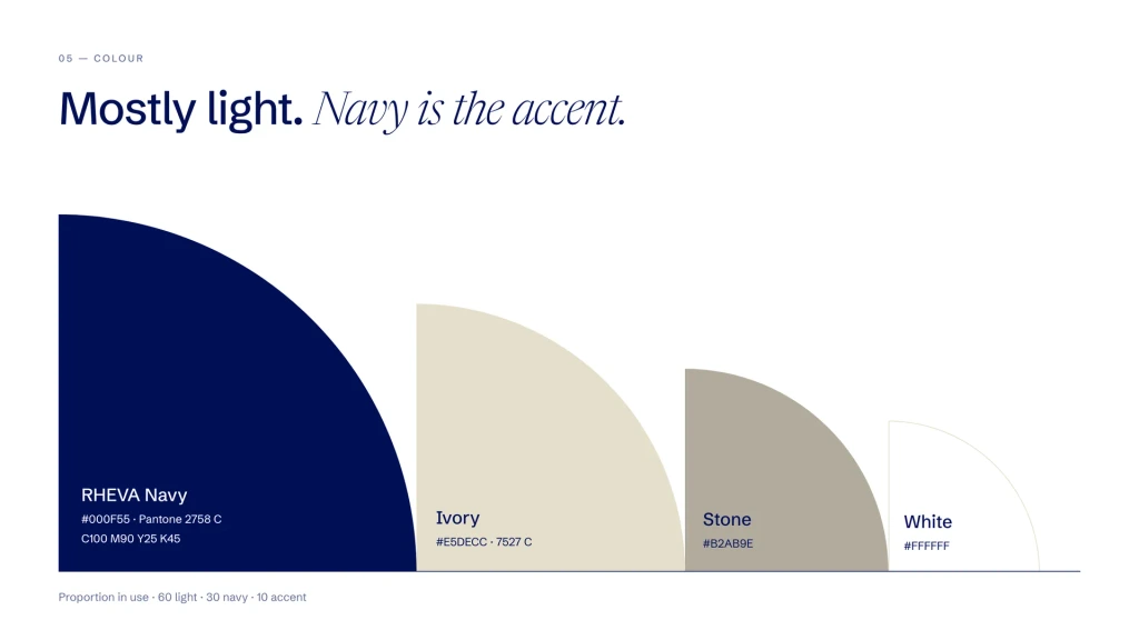
Mostly light. Navy is the accent.
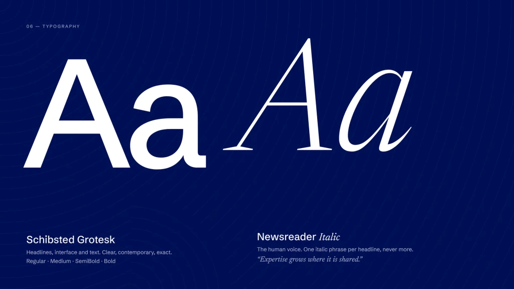
Schibsted Grotesk and Newsreader Italic.
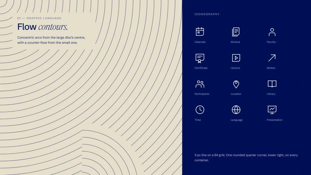
Flow contours and a 20-icon set built on the same ratio.
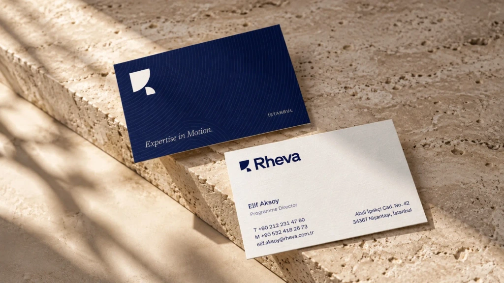
Business cards on ivory and navy stock.
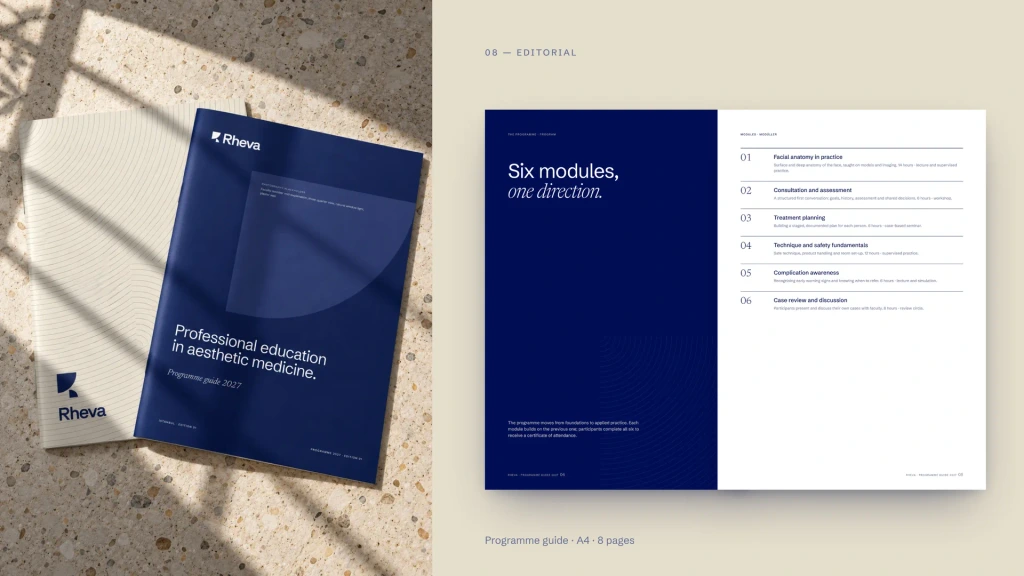
Programme guide: six modules, one direction.
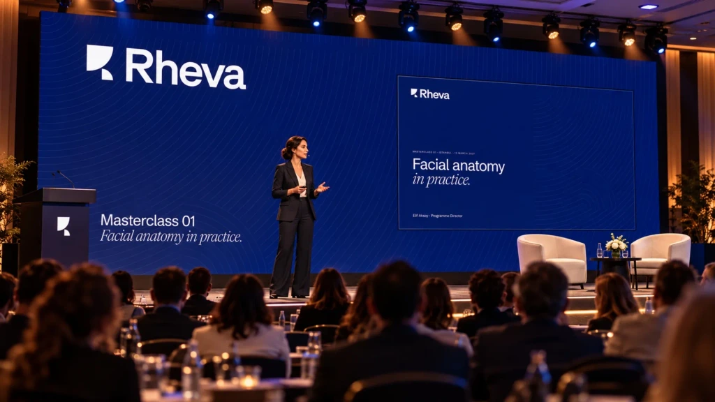
Masterclass 01: Facial anatomy in practice.
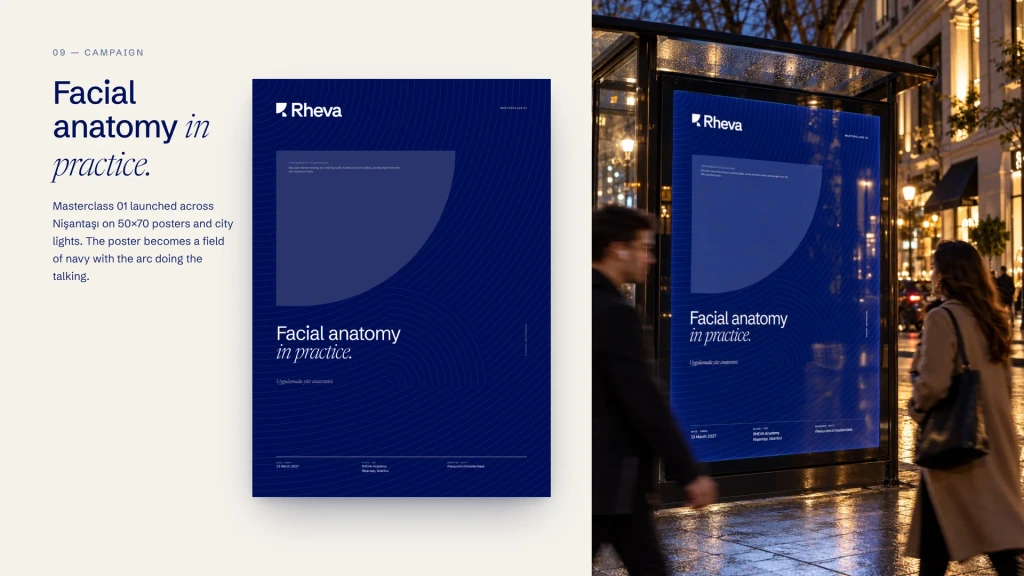
The campaign poster, in print and on the street.
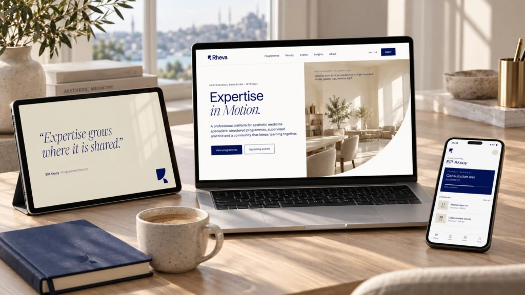
Website, tablet and mobile.
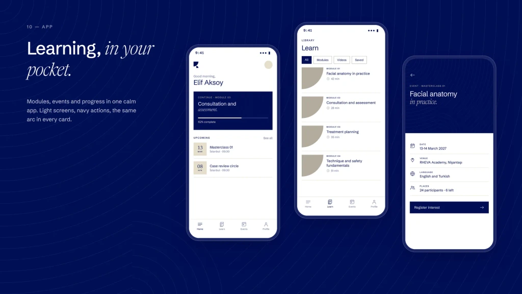
The learning app: modules, events and progress.
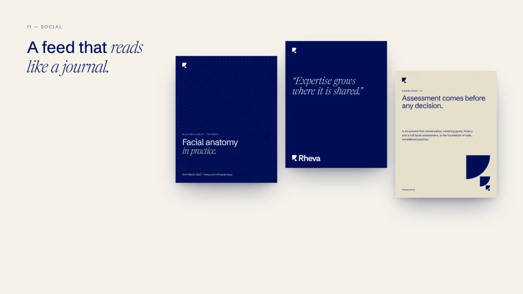
A social feed that reads like a journal.
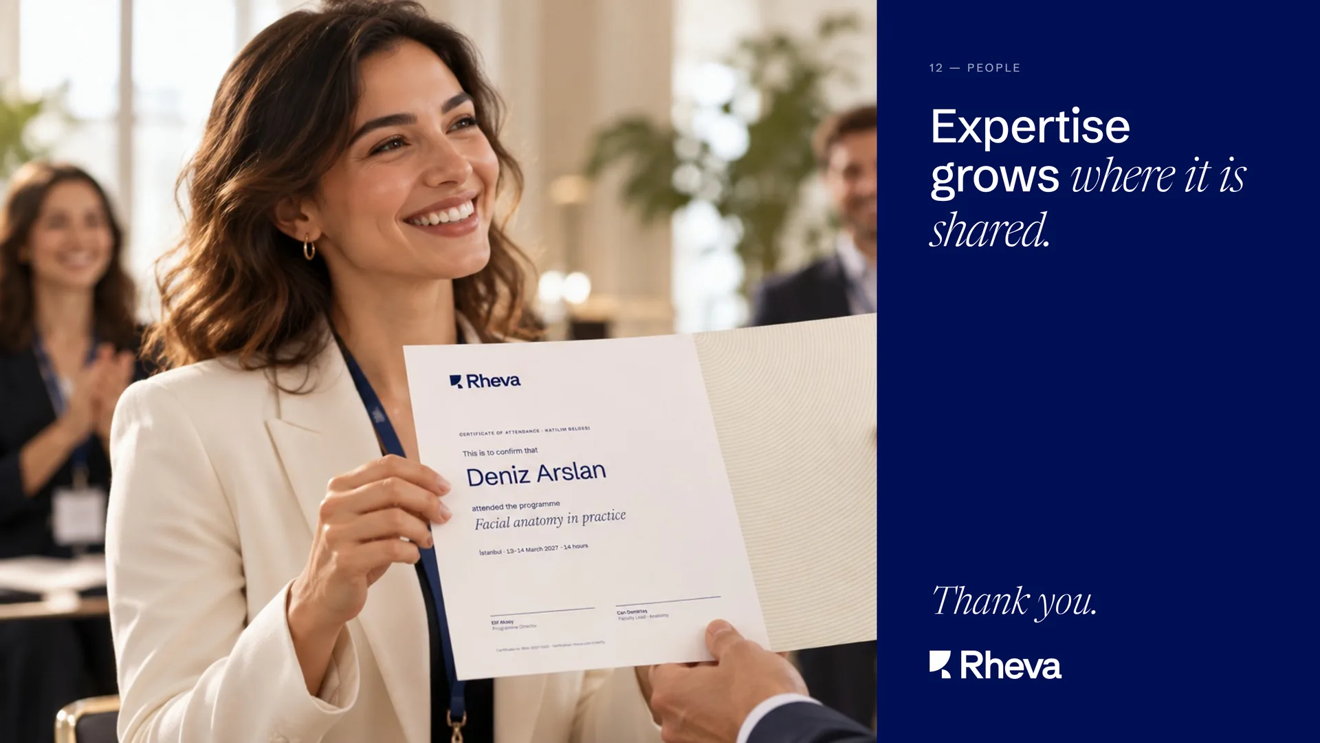
Expertise grows where it is shared. Thank you.

Ready to build
a brand people
remember?

Tell us where your brand is today and where you want it to go. Let’s create an identity that helps close the gap.