Case study

IMRAYA

IMRAYA Arabic and English logo over Saudi desert dunes, brand identity cover

IMRAYA is a premium real estate development and investment brand based in Makkah Al-Mukarramah, Saudi Arabia. The identity is built around architectural clarity, trust and long-term value, using refined geometry, bilingual communication and a sophisticated visual system designed for property, corporate and investment applications.
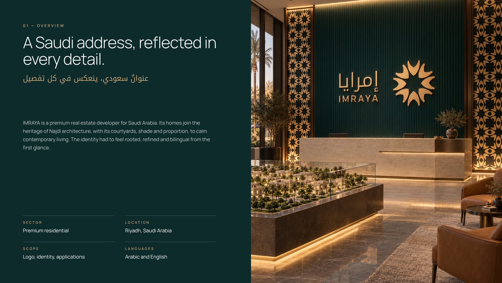
IMRAYA brand identity overview with the logo in a sales centre lobby
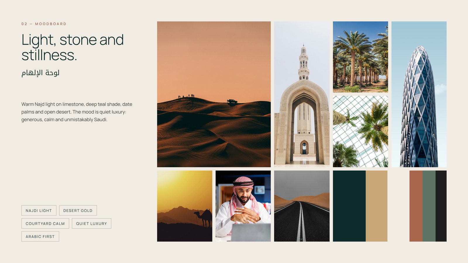
IMRAYA moodboard of Najdi architecture, desert light and courtyard calm
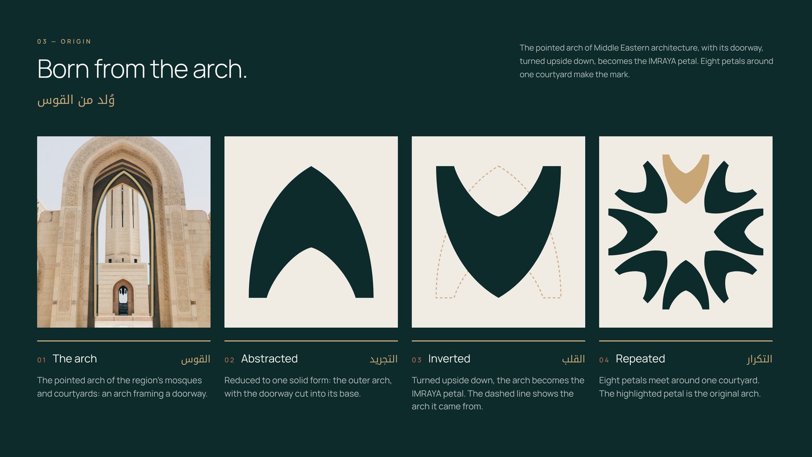
IMRAYA logo concept: a pointed Islamic arch turned upside down becomes a petal
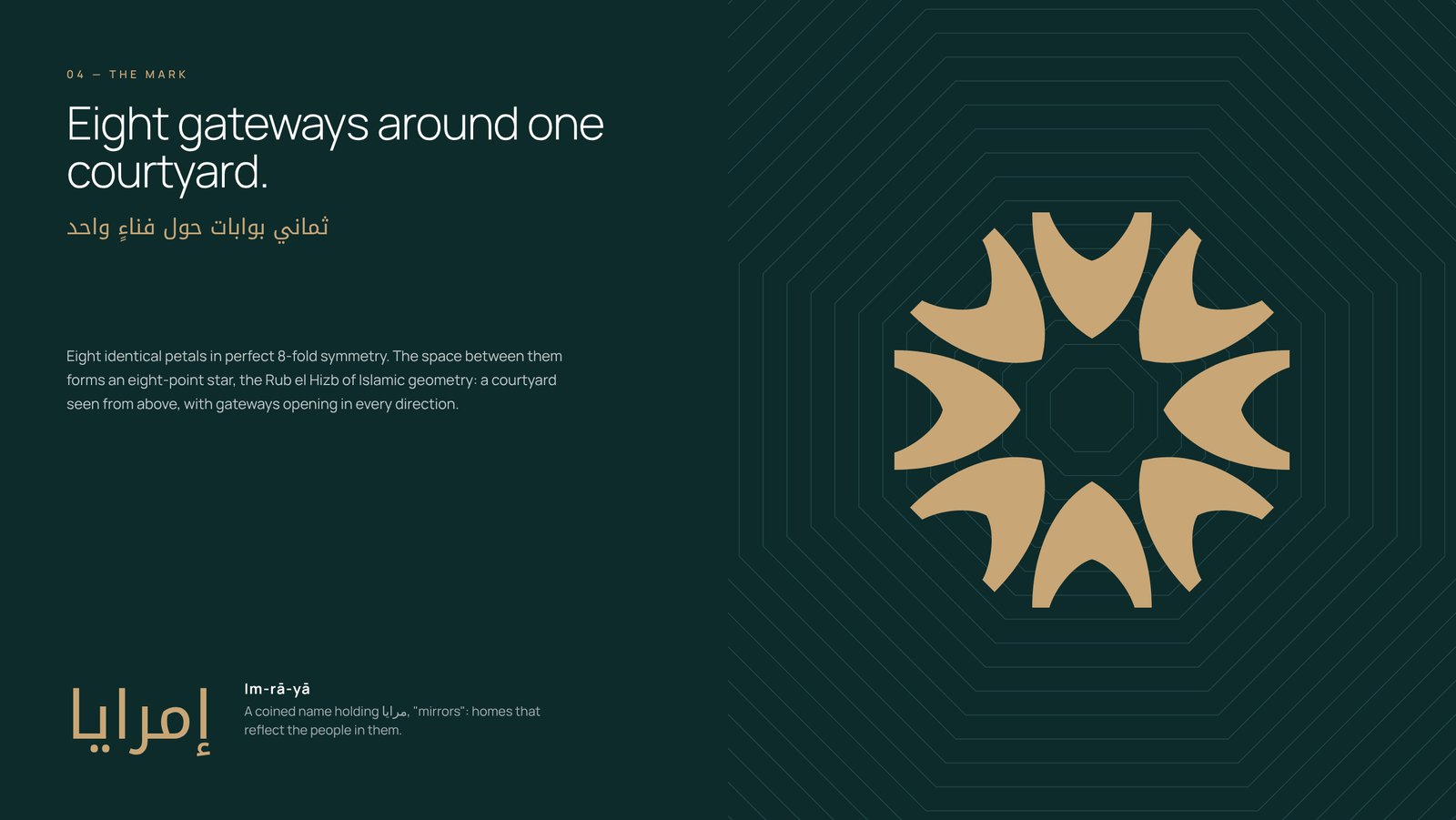
IMRAYA icon of eight arch petals forming an eight-point Islamic star
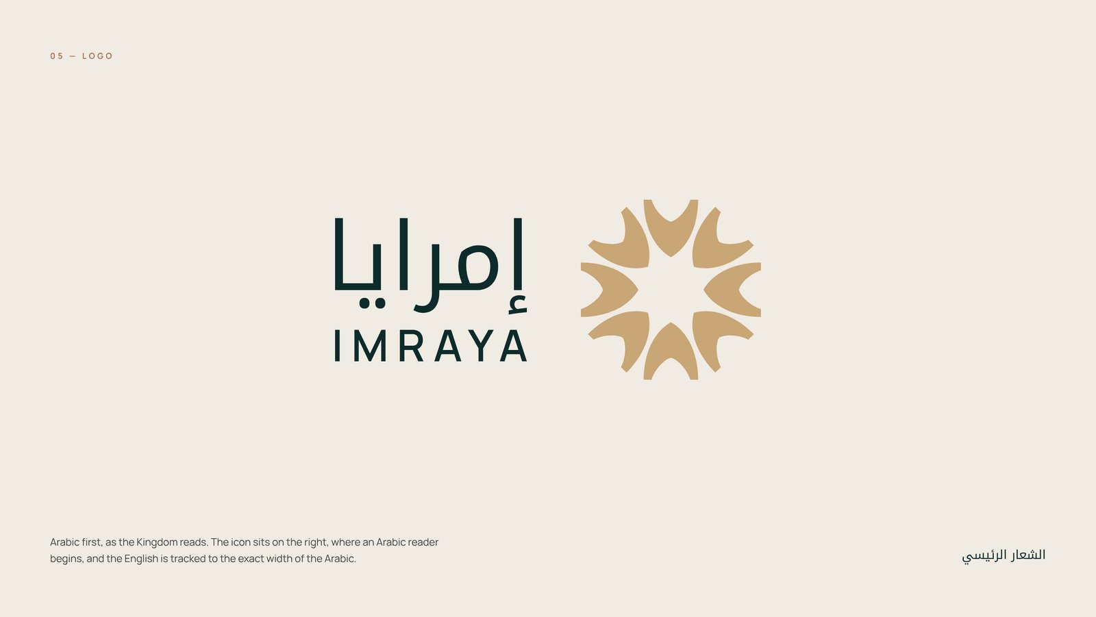
IMRAYA primary bilingual logo, Arabic first with the icon on the right
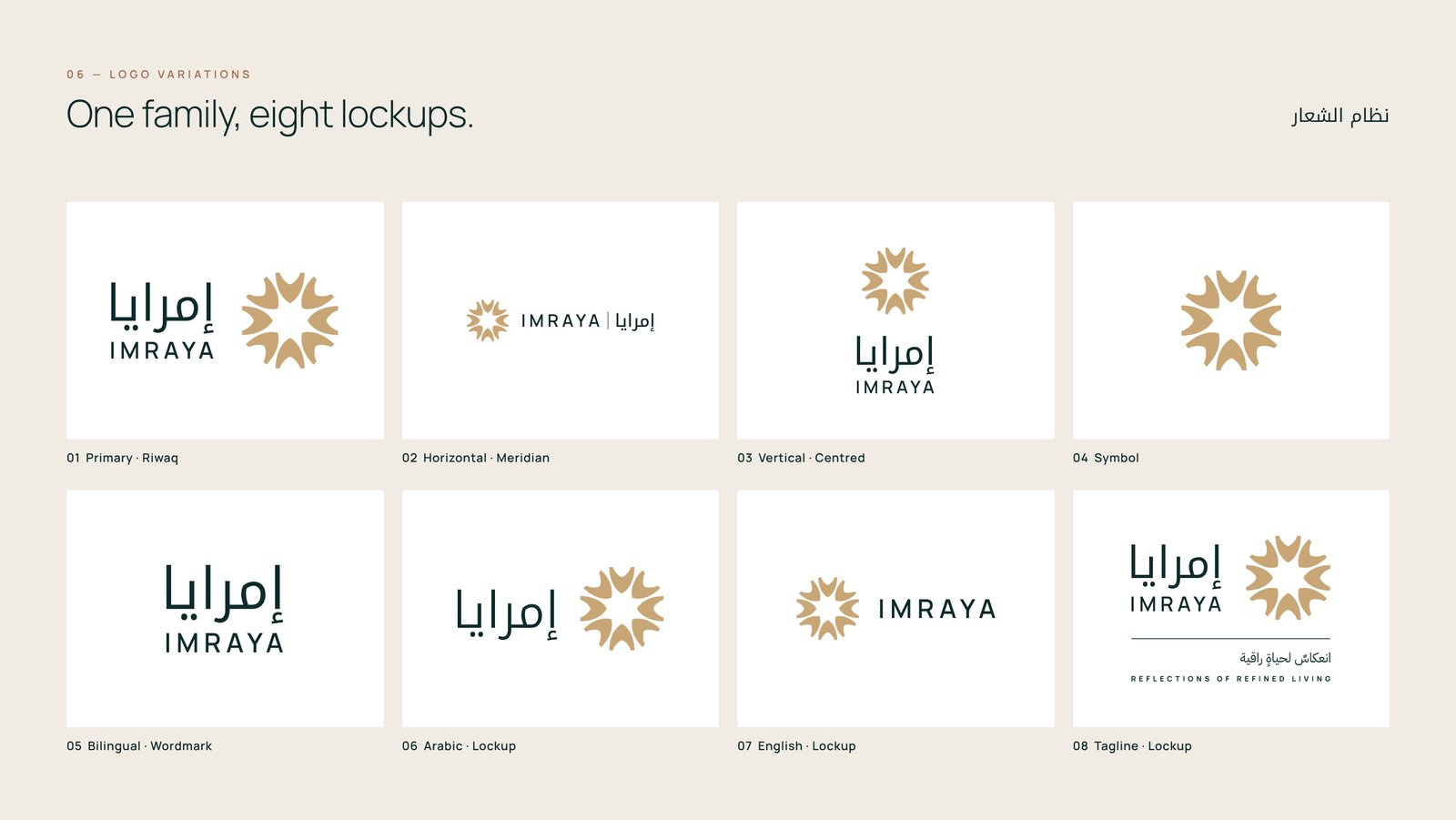
IMRAYA logo system with eight bilingual lockup variations
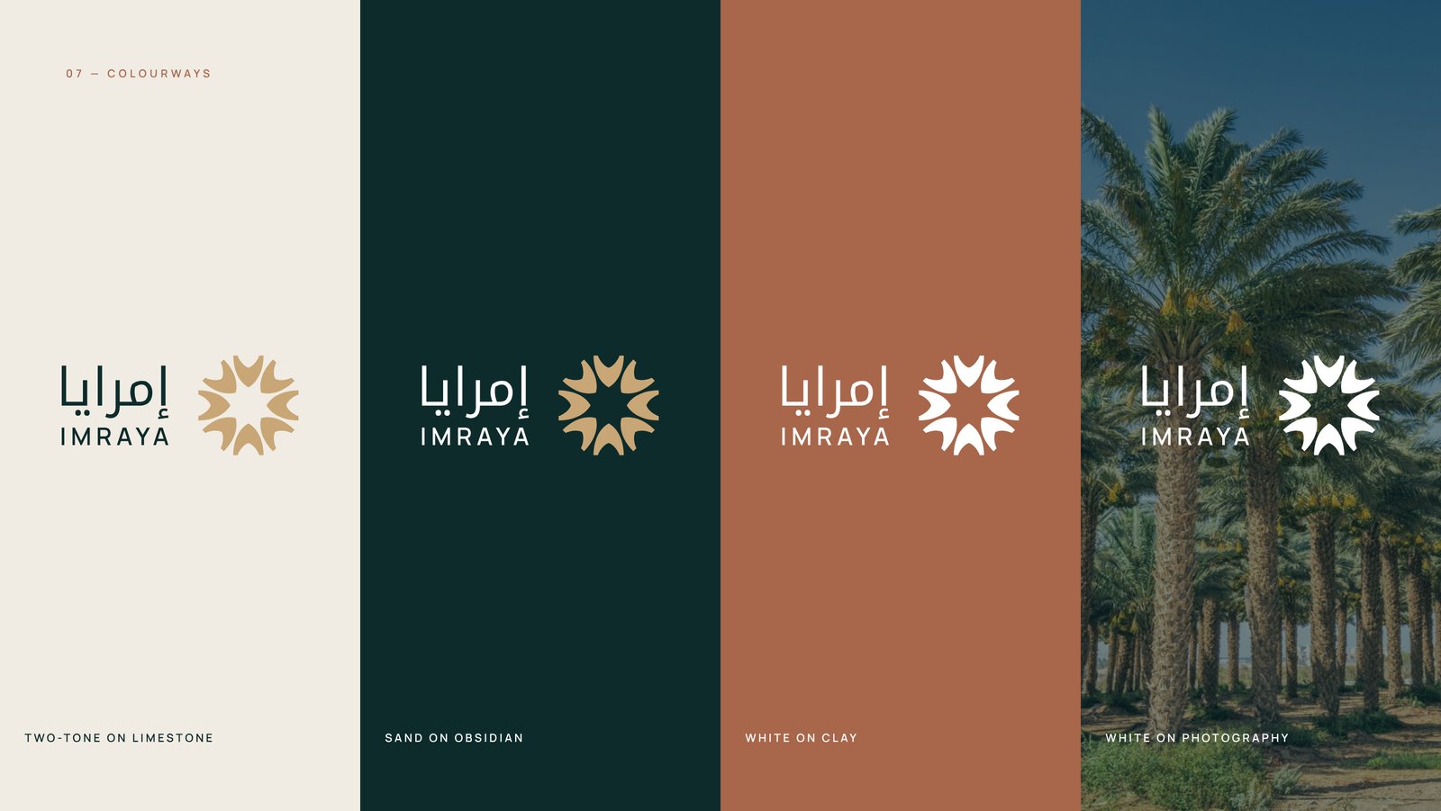
IMRAYA logo shown on Limestone, Obsidian, Clay and photography
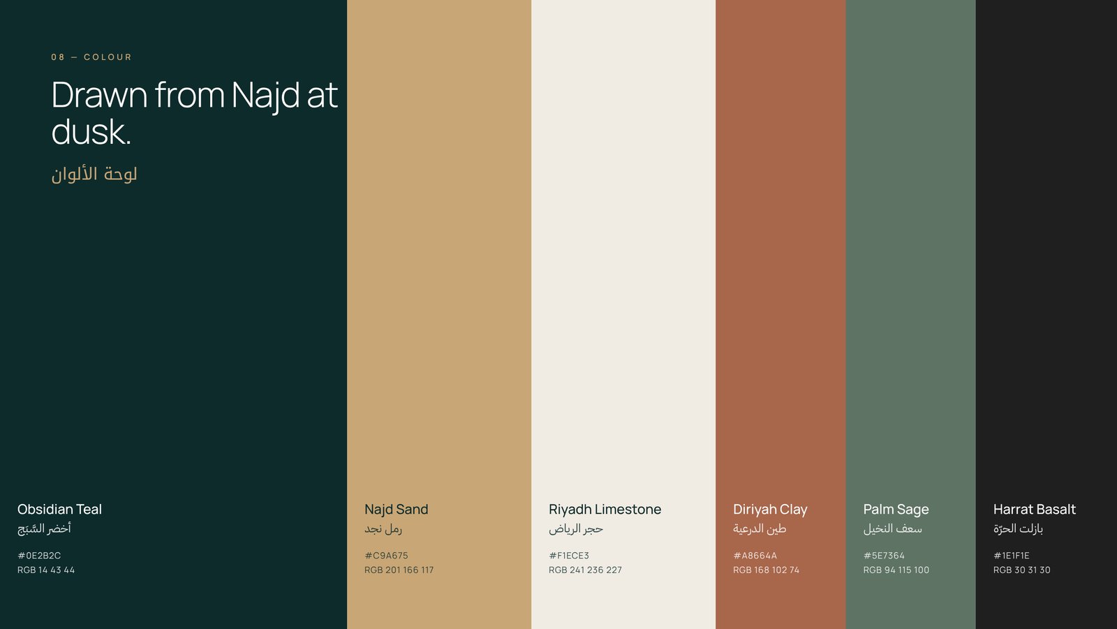
IMRAYA colour palette: Obsidian Teal, Najd Sand, Riyadh Limestone, Diriyah Clay, Palm Sage
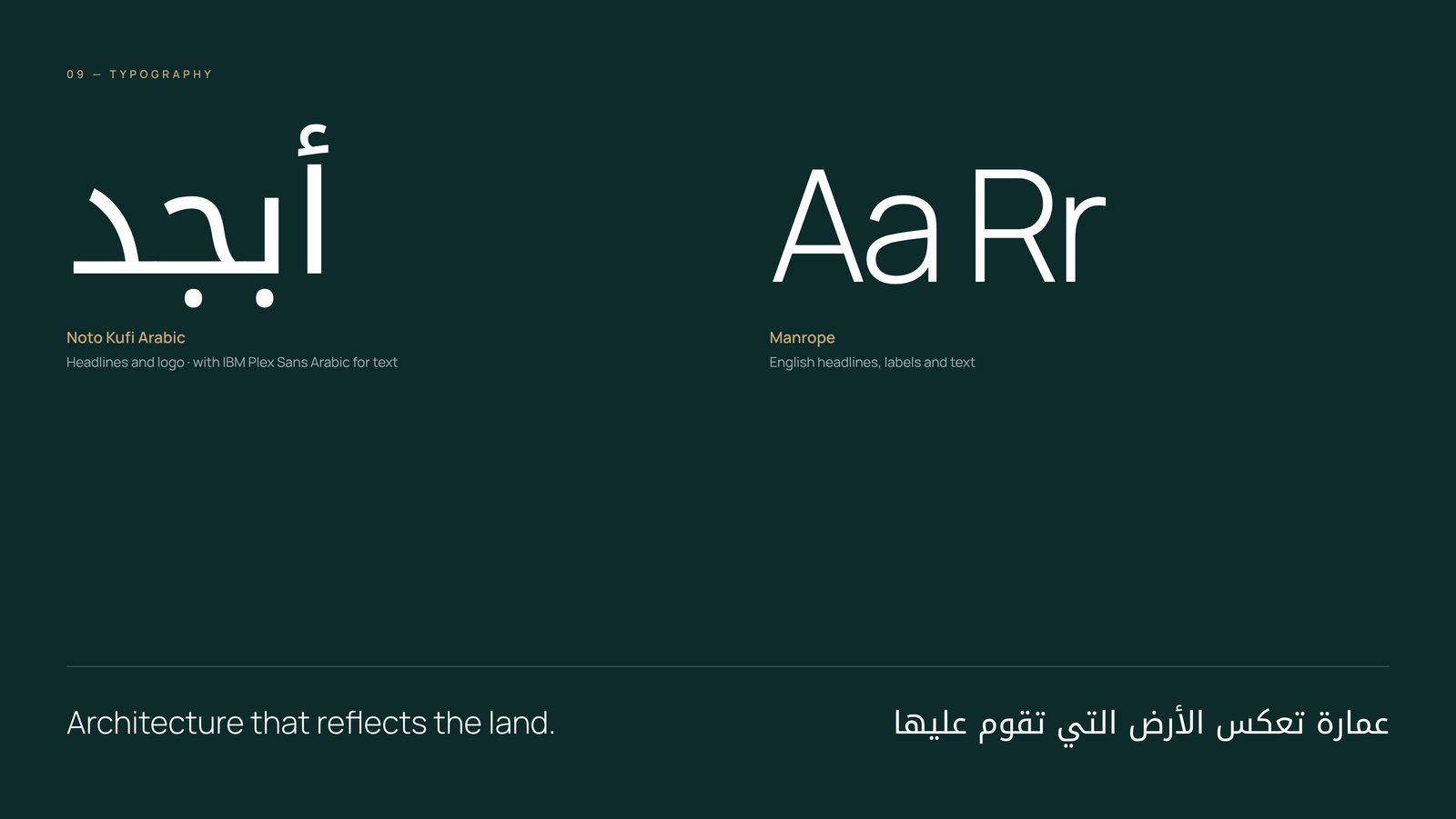
IMRAYA typography pairing Noto Kufi Arabic with Manrope
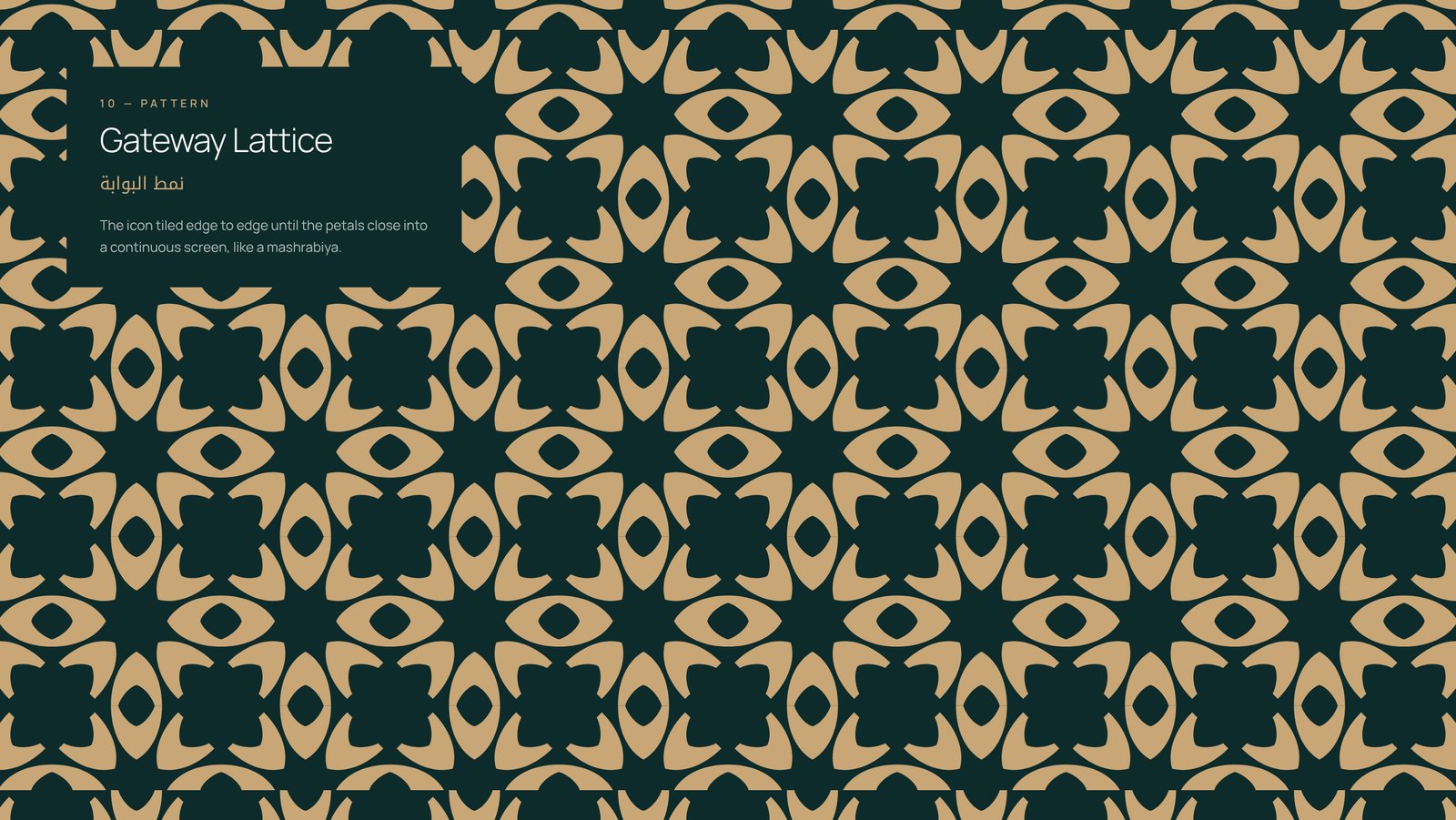
IMRAYA Gateway Lattice pattern inspired by mashrabiya screens
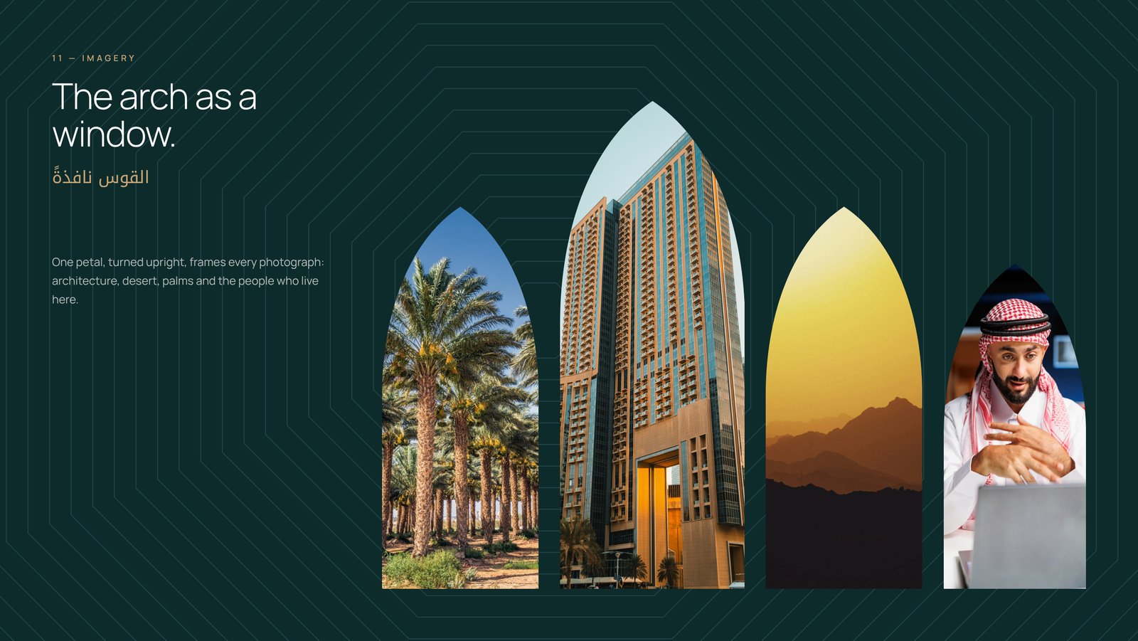
IMRAYA photography framed in arch windows
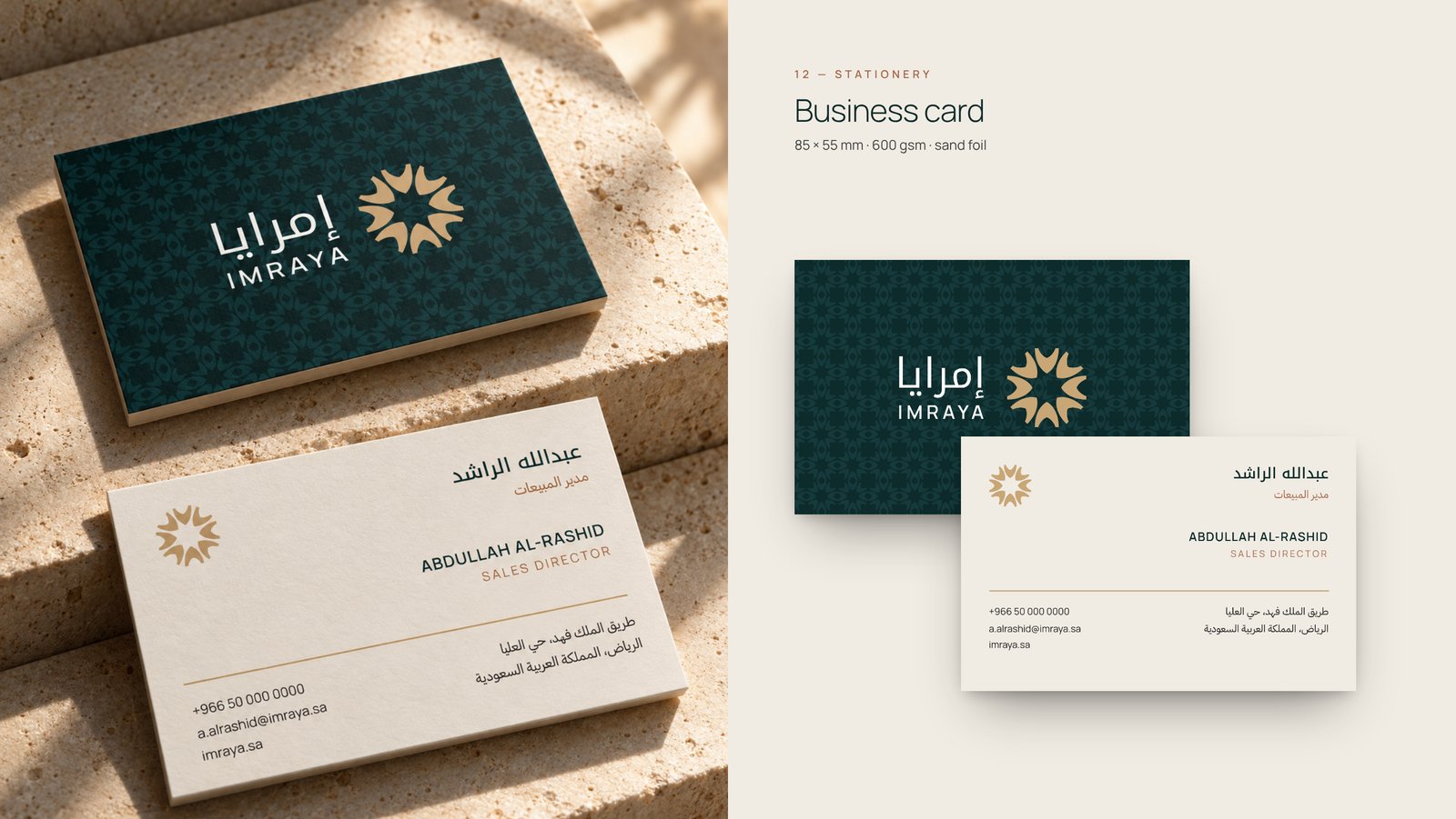
IMRAYA business cards with sand foil next to the print artwork
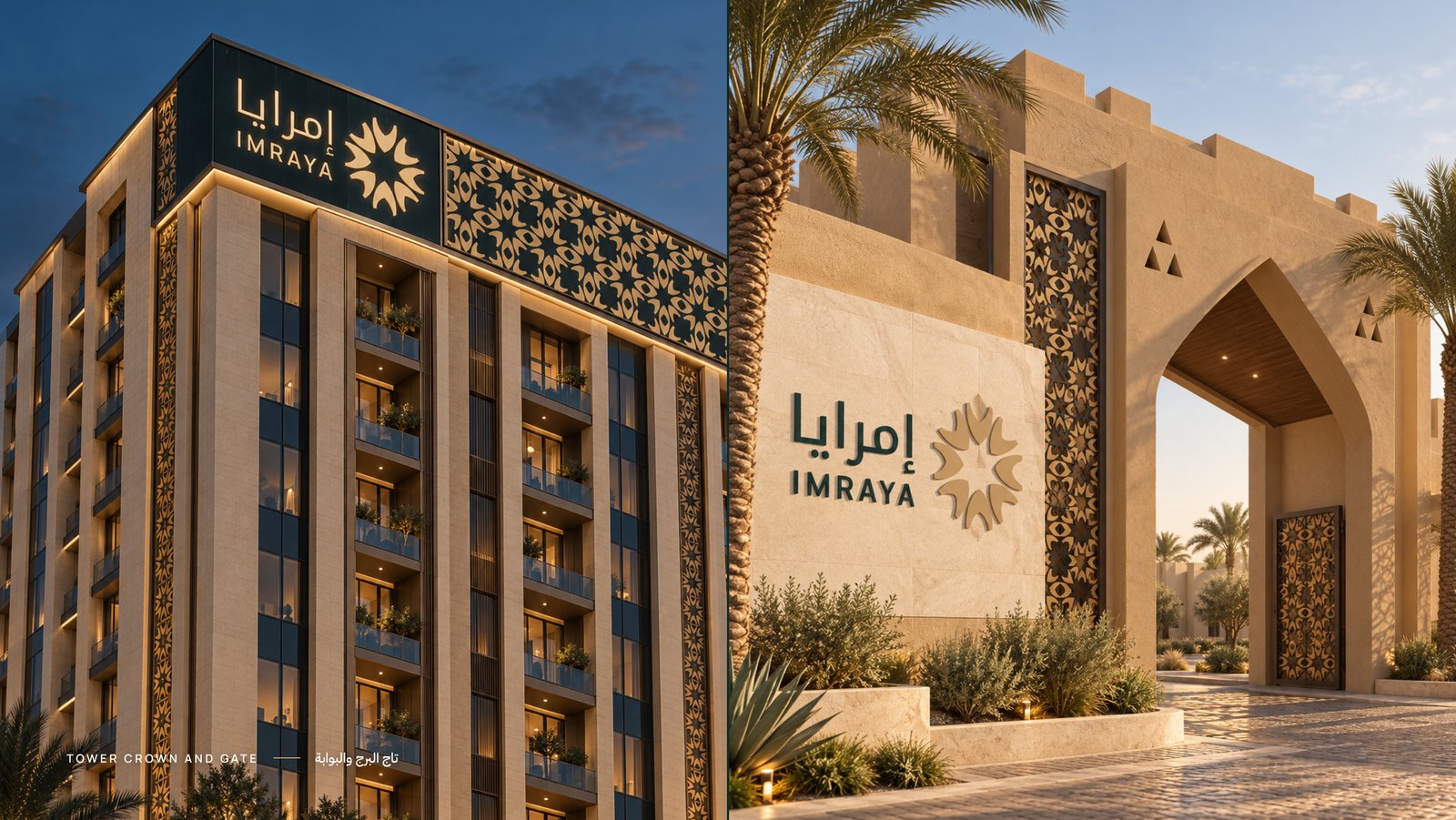
IMRAYA logo on a residential tower crown and community gate
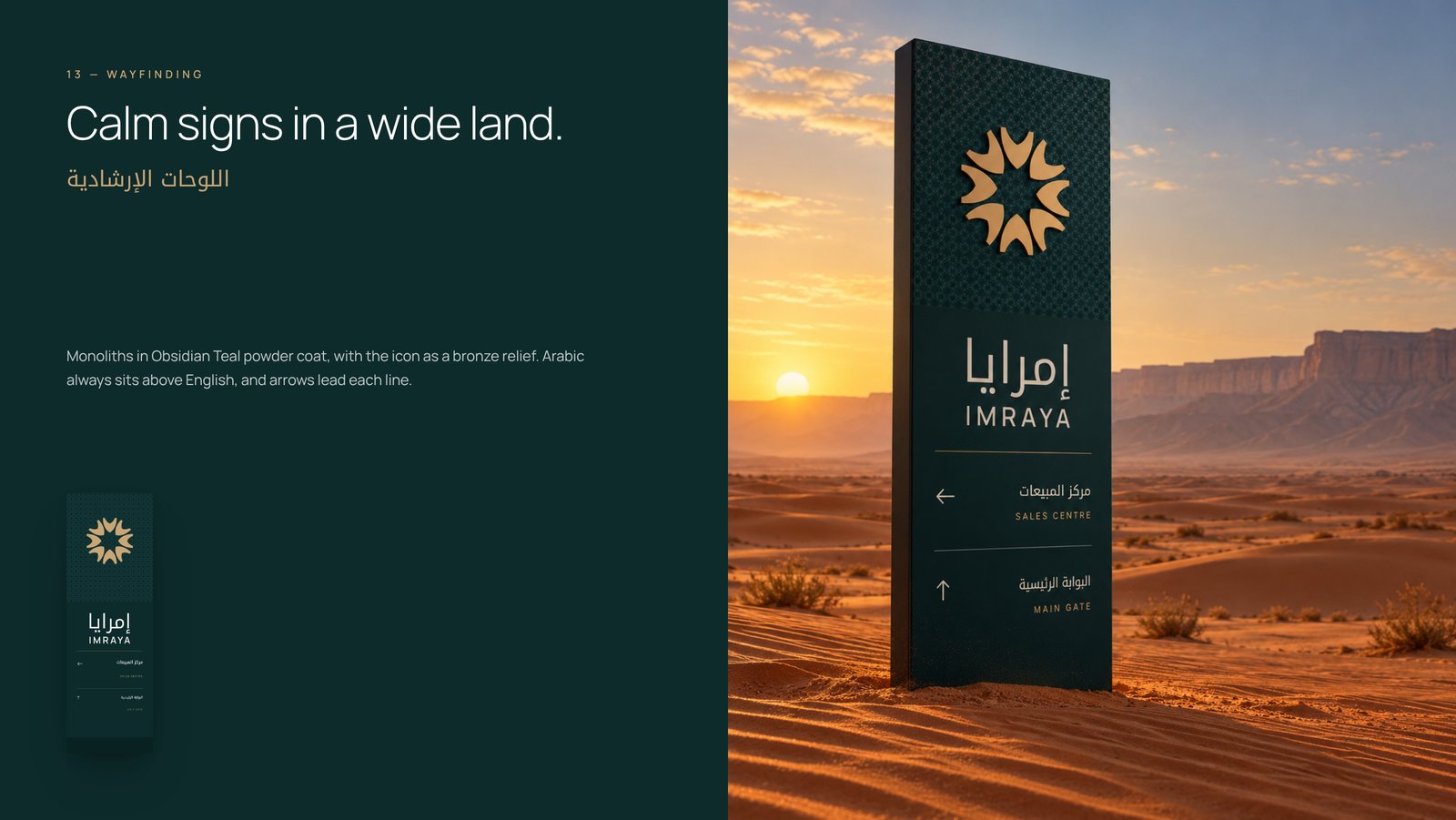
IMRAYA wayfinding monolith in Obsidian Teal with a bronze icon
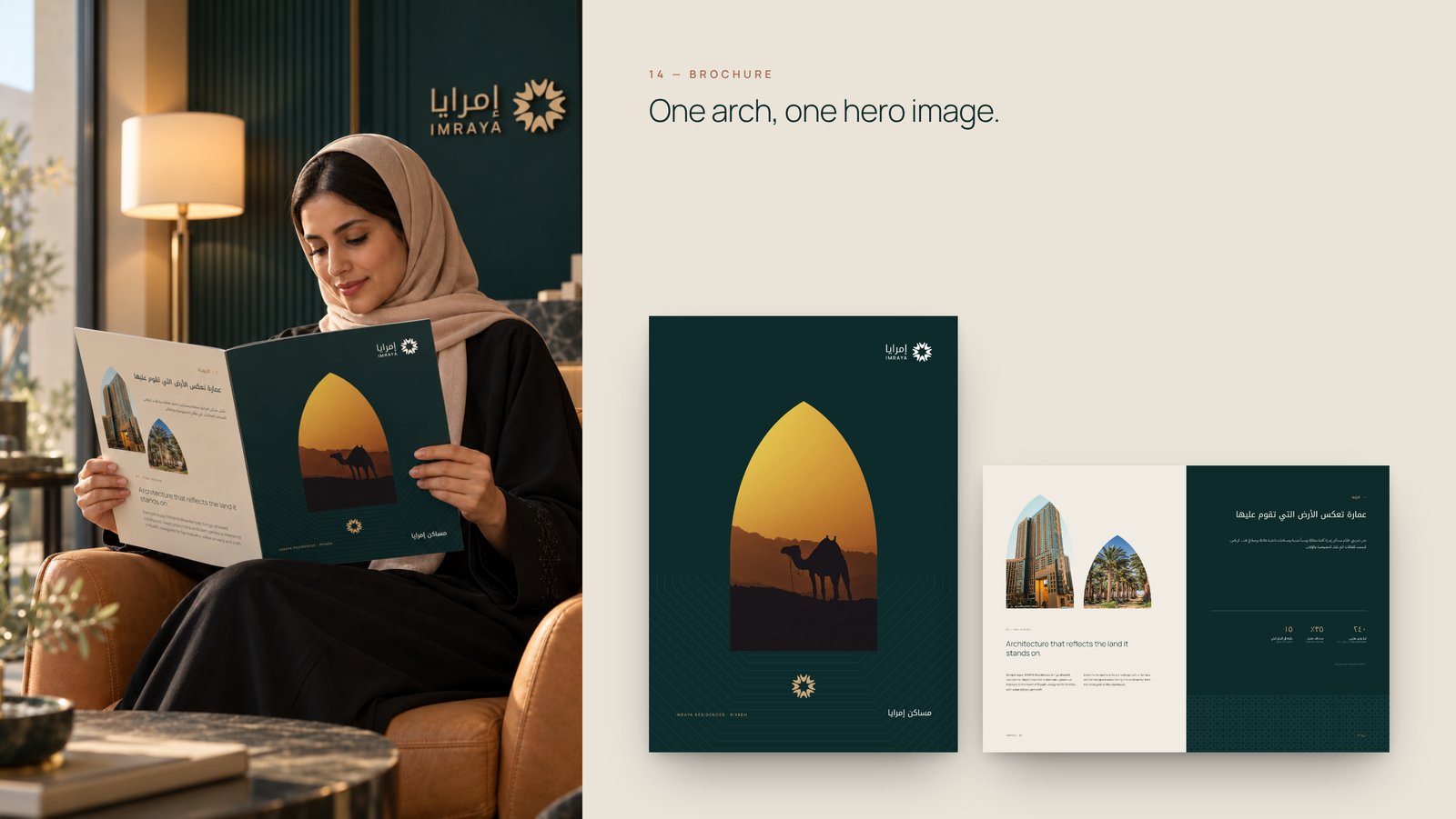
IMRAYA real estate sales brochure cover and spread
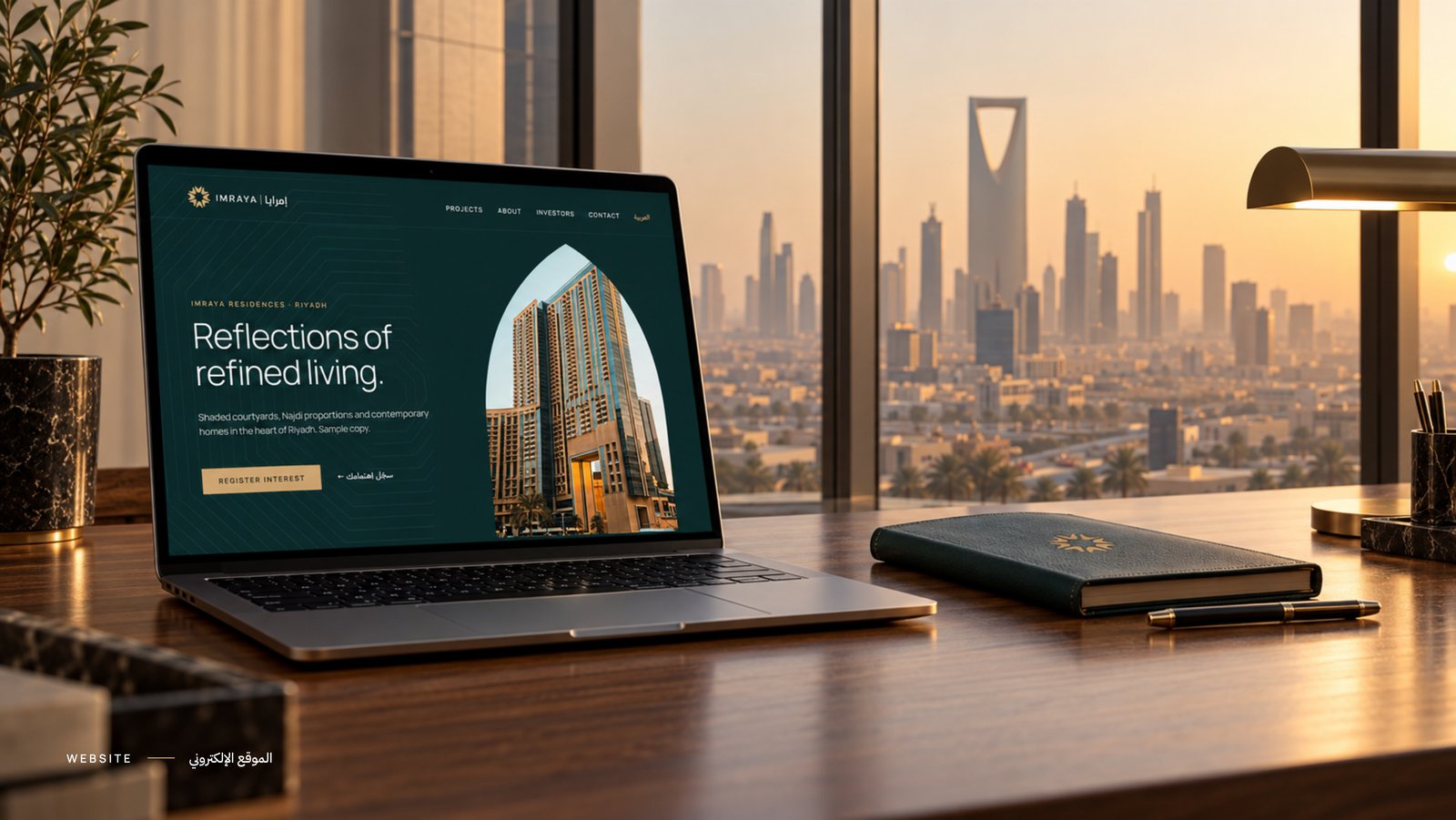
IMRAYA real estate website design with the arch window hero
IMRAYA thank you slide with a camel at sunset

Ready to build
a brand people
remember?

Tell us where your brand is today and where you want it to go. Let’s create an identity that helps close the gap.